
Correction Technology
Best Practices for Effective Data Visualization
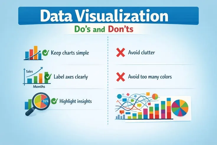
Implement appropriate chart types and simplify visuals to highlight key insights in your data.
Changes accepted
2 edited
Computed from the content the publisher accepted, line by line. Neither the contributor nor CitePep writes this diff by hand.
−Within two years of her presentation, sanitary reforms had reduced the death…
+Sanitary reforms during the war had reduced the death rate in military hospit…
−a polar area chart she invented specifically for this purpose
+a polar area chart she developed and popularized for this purpose
Why this is better
Corrected the chronology (the mortality drop occurred during the war, before Nightingale's 1858 presentation, not within two years after it) and corrected the claim that Nightingale unverified the polar-area/rose chart form outright; she developed and popularized her version of a pre-existing chart type. Verified fully applied in body, no stale mentions remain.
More by Melik Can Sariyer in Technology
- Correction Zoom, Google Meet, or Teams: Video Conferencing in 2026
- Correction Comparing Writing Tools: Choose the Best Software
- Correction The Dark Web: Myths vs. Reality Explained
- Correction What Is Version Control and Why Every Developer Needs It