
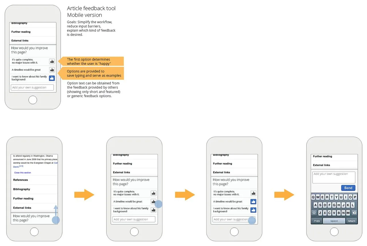
Mobile-First Design: Building for Small Screens First
This is the CitePep accuracy record for “Mobile-First Design: Building for Small Screens First”, published by When Notes Fly. It lists every change experts checked and accepted on that page.
What is mobile first design, and the shortcut that defeats it, about 53 percent of top-1000 sites just hide desktop content on mobile with CSS.
What has been corrected on this page?
Every accepted correction to this page is recorded with the exact change, so readers can see how the page improved over time.
-
A claim-level statistics check of this article: 1 study claim with no locatable published source was removed.
BeforeA 2023 analysis by Semrush of over 800,000 URLs found that pages with mobile usability issues (as identified by Google Search Console) ranked on average 4.5 positions lower for matched keywords than mobile-optimized equivalents.
AfterRemoved.
Why: Each study and survey figure in the article was checked against the published source. Claims for which no published source could be located were removed.
View the full record →
Who checked this page?
1 contributor has checked "Mobile-First Design: Building for Small Screens First" on When Notes Fly. Each name below links to that person's public CitePep profile, where every contribution they have made is listed with the exact change they proposed.